
While Tottenham Hotspur’s home kits always feature the traditional lilywhite colourway, the club’s away kits have to stand out from the crowd. Here are the 10 best away kits in Tottenham’s history.
You can’t go far wrong with the Tottenham home kits, really. But when Spurs aren’t at White Hart Lane or the Tottenham Hotspur Stadium, what then?
Well, across various kit manufacturers through the years, the North London club has turned out in some striking shirts in a range of different colours.
As we wait to see what Nike produce for Ange Postecoglou‘s men next, here’s our rundown of the ten best away kits in Tottenham’s history.
10. Green Nike – 2020/21
The 2020/21 season was a really strong campaign for kits, with all three Tottenham strips being winners that year. This dark green effort was unlike anything Spurs have ever worn before, with touches of black, light green, and pink adding tasteful contrasts to the main kit.

9. Blue Nike – 2023/24
I’m a sucker for a collar on a football kit, so imagine my delight when I saw the classy navy blue effort Spurs produced for this season. Bonus points for the iridescent badges, but the real winner is the soft purple accents on the neckline and sleeves.

8. Black Under Armour – 2014/15
The Under Armour era at Spurs is underrated, and this slick design gives real prestige vibes. Black kits are rare, so this one feels especially unique, and the yellow accents on the sleeves and stripes through the middle of the shirt are exquisite details.

7. Purple Puma – 2011/12
Spurs have had more purple kits than you’d think, and they almost always work. From a distance, this looks like a fairly simple shirt, but look a little closer and you’ll spot some great detailing in the texture of the kit. The shade of purple is perfect, and the contrasting white on the collar, sleeves, and logo really make this one pop.

6. Purple and navy Pony – 1995/96
Pony never miss. This is such a retro design and I feel like you simply would not see something like this in the modern era, which is a shame. It’s got pretty much everything you could want from an away kit: snazzy collar, interesting colours in a stripy design, and a bold club crest.
5. Navy Hummel – 1987/88
We’re taking it way back in time with this one, and those Hummel diagonal pinstripes are the key to making this away kit a success. Throw in a deep V-neck and a great shade of blue, and you’ve got a shirt that I am now looking to add to my collection as we speak.
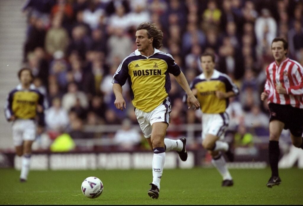
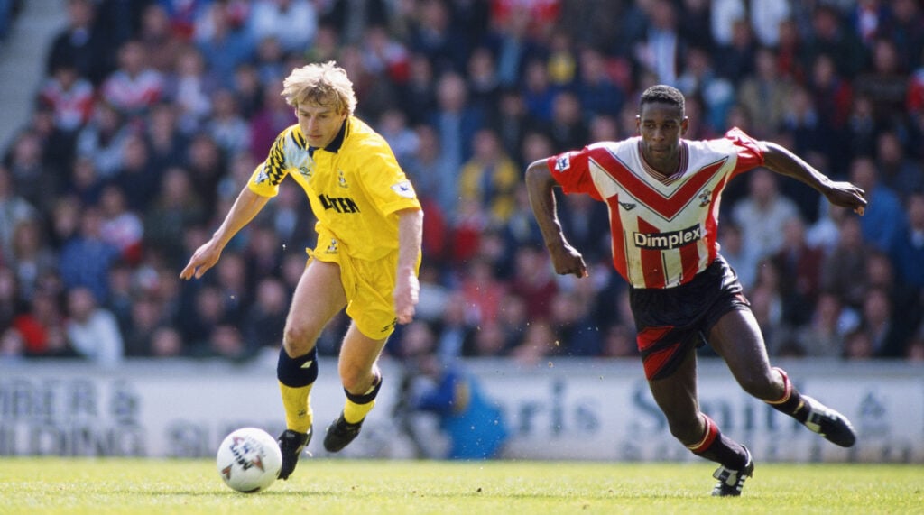
4. Yellow and blue Adidas – 1999/00
Tell me this kit doesn’t remind you of Steffen Iversen? This Adidas effort is the perfect accompaniment to the classy home kit of the same year, with an incredibly bold combination of navy blue and yellow to make us stand out from the crowd. I miss the three stripes on the Tottenham sleeves.
3. Blue Pony – 1997/98
Has there ever been a better pair of kits than our home and away set in 1997/98? Featuring the same ribbed texture and statement V-neck as the white home shirt, this away kit is brought to life by a vivid blue, white, and yellow colourway. It may be almost 30 years old now, but this is what football kits should look like!

2. Yellow Umbro – 1991/94
This yellow effort spent some time as Tottenham’s third kit a little later on in its shelf life, but started out as our away kit for the FA Cup-winning campaign. Like the home shirt, you’ve got the neat little collar with the button to keep things in place, but the selling point here is the sharp, abstract pattern on the shoulder.
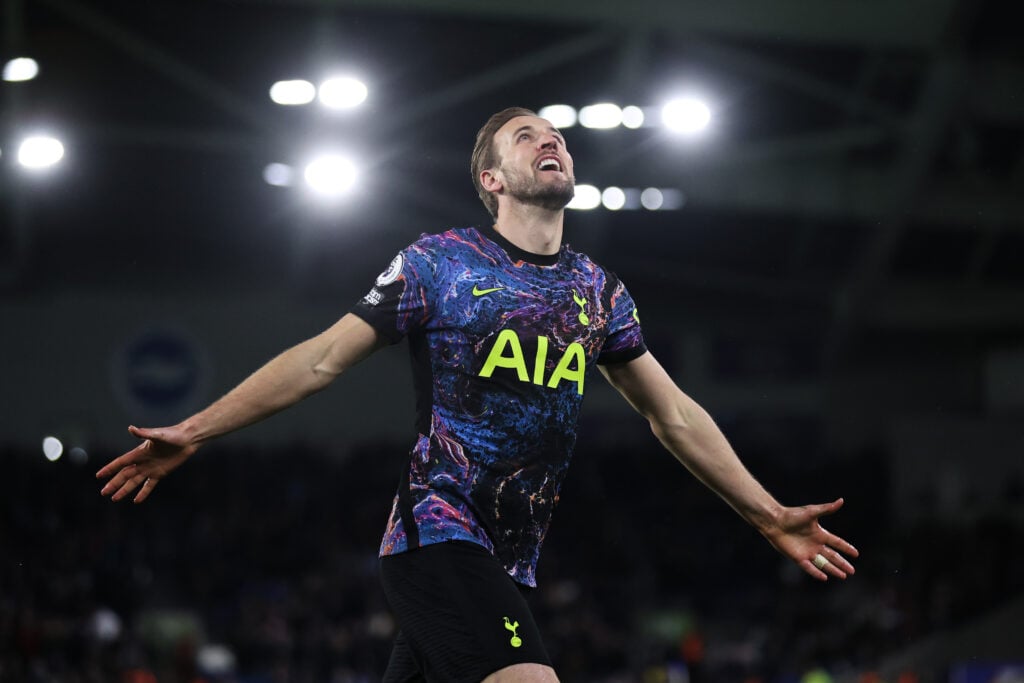
1. Space Nike – 2021/22
Is it a galaxy? Is it a paint spill? Who knows, but it’s absolutely stunning. The neon detailing is the perfect trim for this one-of-a-kind design, and the Spurs team provided some great memories as they stormed to fourth place wearing this kit in the heydays of Antonio Conte’s reign. We will never get a better away kit than this.